Adapting the Calendar Control for Week Numbers
October 7, 2009
New York, N.Y.
I always like getting email describing a programming problem that (1) is generalized enough to be of interest to others, (2) I can figure out in a few hours and, (3) I can then describe in a blog entry. Meeting those requirements exactly was an email I received this morning asking if I knew how to include week numbers in the standard WPF Calendar control from the WPF Toolkit, so it looks something like this:
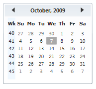
Now just by a glance we know we're in the 41st week of the year.
The WPF Toolkit that includes the Calendar control is available from the WPF Codeplex page. (Besides the Calendar and DatePicker controls, the Toolkit also includes charting controls that I should have mentioned in my recent MSDN Magazine article "Charting with Data Templates".)
I discussed the Calendar and related controls in an earlier article in the July issue of MSDN Magazine, "Customizing the New WPF Calendar Controls", and that article might help for some background information.
When you download the WPF Toolkit, you'll want both binaries and source code. The Binaries directory has the MSI file you'll run to install the DLL's. The Toolkit-Release directory has the source code for the controls, but probably more importantly for practical purposes, the default control styles and templates. In particular, the /Toolkit-Release/Calendar/Themes directory has the Generic.xaml file with the default styles and templates for the Calendar, CalendarItem, CalendarDayButton, and CalendarButton controls.
To begin, I created a WPF project with the imaginative name CalendarDemo. (Source code downloadable here.) I set a reference to the WPF Toolkit library, and then I copied the entire style and template for the CalendarItem control from that Generic.xaml file into my Window1.xaml file as a resource. I gave it a resource key of "calItemStyle". After the proper XML namespace declarations were defined to match those in Generic.xaml, I could instantiate a Calendar control like so:
<local:Calendar CalendarItemStyle="{StaticResource calItemStyle}"
VerticalAlignment="Center" />
I began in this way because I knew that adding a column of week numbers to the Calendar control would actually require messing around with the CalendarItem template. Although the Calendar control defines most of the properties and events you'll access in an application program, it's actually the CalandarItem control that provides much of the visuals and internal calendar logic. Here's the part of the CalendarItem template that displays the actual grid of days-of-the-week labels and the day number from 1 through 28, 29, 30, or 31:
<Grid x:Name="PART_MonthView"
Grid.Row="1"
Grid.ColumnSpan="3"
Visibility="Visible"
Margin="6,-1,6,6">
<Grid.RowDefinitions>
<RowDefinition Height="Auto"/>
<RowDefinition Height="Auto"/>
<RowDefinition Height="Auto"/>
<RowDefinition Height="Auto"/>
<RowDefinition Height="Auto"/>
<RowDefinition Height="Auto"/>
<RowDefinition Height="Auto"/>
</Grid.RowDefinitions>
<Grid.ColumnDefinitions>
<ColumnDefinition Width="Auto"/>
<ColumnDefinition Width="Auto"/>
<ColumnDefinition Width="Auto"/>
<ColumnDefinition Width="Auto"/>
<ColumnDefinition Width="Auto"/>
<ColumnDefinition Width="Auto"/>
<ColumnDefinition Width="Auto"/>
</Grid.ColumnDefinitions>
</Grid>
This Grid has seven columns for the seven days of the week, and seven rows: one for the labels and up to six for the days of the month. The CalendarItem code is responsible for filling this Grid with text and numbers.
At first I thought that I could simply add an extra column to this Grid and then derive from CalendarItem to alter the day-filling logic and add some more logic for the week numbers. I should have re-read my article first, because then I would have known that CalendarItem is sealed. A different approach was required.
My train of thought went something like this: If I had some magic WeekNumber control, where would it go? Well, it would go in the CalendarItem template but it would actually require a second Grid with just a single column, and the two Grid objects would need to have the same row heights. So I added that second Grid in front of the first one like so:
<StackPanel Grid.Row="1"
Grid.ColumnSpan="3"
Grid.IsSharedSizeScope="True"
Margin="6,-1,6,6"
Orientation="Horizontal">
<Grid Visibility="{Binding ElementName=PART_MonthView, Path=Visibility}"
Background="AliceBlue">
<Grid.RowDefinitions>
<RowDefinition Height="Auto" SharedSizeGroup="SharedTitleHeight" />
<RowDefinition Height="Auto" SharedSizeGroup="SharedItemHeight" />
<RowDefinition Height="Auto" SharedSizeGroup="SharedItemHeight" />
<RowDefinition Height="Auto" SharedSizeGroup="SharedItemHeight" />
<RowDefinition Height="Auto" SharedSizeGroup="SharedItemHeight" />
<RowDefinition Height="Auto" SharedSizeGroup="SharedItemHeight" />
<RowDefinition Height="Auto" SharedSizeGroup="SharedItemHeight" />
</Grid.RowDefinitions>
<TextBlock Grid.Row="0" Text="Wk" />
</Grid>
<Grid x:Name="PART_MonthView" Visibility="Visible">
<Grid.RowDefinitions>
<RowDefinition Height="Auto" SharedSizeGroup="SharedTitleHeight" />
<RowDefinition Height="Auto" SharedSizeGroup="SharedItemHeight" />
<RowDefinition Height="Auto" SharedSizeGroup="SharedItemHeight" />
<RowDefinition Height="Auto" SharedSizeGroup="SharedItemHeight" />
<RowDefinition Height="Auto" SharedSizeGroup="SharedItemHeight" />
<RowDefinition Height="Auto" SharedSizeGroup="SharedItemHeight" />
<RowDefinition Height="Auto" SharedSizeGroup="SharedItemHeight" />
</Grid.RowDefinitions>
<Grid.ColumnDefinitions>
<ColumnDefinition Width="Auto"/>
<ColumnDefinition Width="Auto"/>
<ColumnDefinition Width="Auto"/>
<ColumnDefinition Width="Auto"/>
<ColumnDefinition Width="Auto"/>
<ColumnDefinition Width="Auto"/>
<ColumnDefinition Width="Auto"/>
</Grid.ColumnDefinitions>
</Grid>
</StackPanel>
So now both Grid objects are side-by-side in a StackPanel. The Grid attached properties and the Margin has been moved to that panel. Notice the use of the Grid.IsSharedSizeScope attached property and the SharedSizeGroup settings on the RowDefinition objects. This ensures that the two Grid objects share their row heights. Also, when the second Grid gets its Visibility property set to Hidden (which the CalendarItem code does if it's switching to a Year or Decade view), then the new Grid becomes Hidden as well. I even have a little TextBlock in the first Grid for the column heading.
Once I wrote this markup — and I couldn't really see another good way to get an extra column of information into the template — it became very obvious to me that I would need to put six instances of the hypothetical WeekNumber control in this Grid following the TextBlock with the column heading:
<src:WeekNumber Grid.Row="1" />
<src:WeekNumber Grid.Row="2" />
<src:WeekNumber Grid.Row="3" />
<src:WeekNumber Grid.Row="4" />
<src:WeekNumber Grid.Row="5" />
<src:WeekNumber Grid.Row="6" />
For convenience, I decided to derive WeekNumber from TextBlock so that it could just figure out what its text should be and set it Text property in code. To set the correct value, the WeekNumber control would need access to the Calendar control hosting the CalendarItem because that's the control that has the crucial DisplayMode and DisplayDate properties required to calculate the week numbers for a particular month and year.
I gave WeekNumber a dependency property called Calendar of type Calendar and wrote the property-changed handler to install handlers for the DisplayModeChanged and DisplayDateChanged events of Calendar. In XAML, each of the instances of WeekNumber gets a RelativeSource binding accessing the parent Calendar control:
<src:WeekNumber Grid.Row="1"
Calendar="{Binding RelativeSource={RelativeSource
AncestorType=local:Calendar}}" />
The calculation of each week number takes account of the day-of-the-week when the year begins, the day-of-the-week when the month begins and the Grid.Row attached property.
Then it was just a matter of styling the text in this new Grid.