Styled Lines
February 8, 2006
Lonely in NYC (because Deirdre's gone to Roscoe)
And now for another exciting installment of "What's That XAML?"
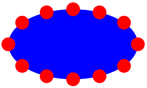
Well, I guess the title of the blog entry gave it away. This is not 12 little circles surrounding an ellipse. It's actually an Ellipse with a half-inch perimeter drawn with a dotted line. If you ever had a question about how the Fill and the Stroke of a shape is based on the geometrical size of the shape, this image should make it clear.
The XAML that produced this image is TwoEllipses.xaml and it actually draws two ellipses. The one used for the graphic is based on the Ellipse element. The other is an Image element containing a DrawingImage based on an EllipseGeometry. Here's the complete XAML file if you don't feel like downloading it:
-
<!-- ==============================================
TwoEllipses.xaml (c) 2006 by Charles Petzold
============================================== -->
<Grid xmlns="http://schemas.microsoft.com/winfx/avalon/2005"
xmlns:x="http://schemas.microsoft.com/winfx/xaml/2005">
<Grid.ColumnDefinitions>
<ColumnDefinition />
<ColumnDefinition />
</Grid.ColumnDefinitions>
<Ellipse Grid.Column="0"
Margin="0.5in"
Fill="Blue"
Stroke="Red"
StrokeThickness="36pt"
StrokeDashArray="0,2"
StrokeDashCap="Round">
</Ellipse>
<Image Grid.Column="1"
Margin="0.5in">
<Image.Source>
<DrawingImage>
<DrawingImage.Drawing>
<GeometryDrawing Brush="Blue">
<GeometryDrawing.Geometry>
<EllipseGeometry RadiusX="1"
RadiusY="1"
Center="0.5,0.5" />
</GeometryDrawing.Geometry>
<GeometryDrawing.Pen>
<Pen Thickness=".25"
Brush="Red"
DashCap="Flat"
DashStyle="{x:Static DashStyles.Dash}">
</Pen>
</GeometryDrawing.Pen>
</GeometryDrawing>
</DrawingImage.Drawing>
</DrawingImage>
</Image.Source>
</Image>
</Grid>
The methods in the DrawingContext class use a Pen to stroke lines, and so does GeometryDrawing. The DashStyle property of the Pen is an object of type DashStyle, which is a class rather than (as one might expect from Windows Forms programming) an enumeration. The DashStyle class has a Dashes property that indicates the on/off pattern as an array of doubles. (DashStyle also includes an Offset property to indicate where the pattern begins.) There's also a DashStyles class (notice the plural) that has five static properties of type DashStyle. These static properties are the expected Solid, Dot, Dash, DashDot, and DashDotDot. So in code, it's easy to say:
-
pen.DashStyle = DashStyles.Dot;
However, there's no DashStyleConverter class, so in XAML it's rather more awkward (as we'll see).
If a styled line is wide enough, then the ends of the dots and dashes become important. These are governed by the DashCap property of Pen, which is set to one of the members of the PenLineCap enumeration: Flat, Round, Square, or Triangle.
What's different about the System.Windows.Shapes library is that there aren't any pens around, at least not externally. Instead, Shape defines a series of properties that correspond to the properties of Pen. These properties include Stroke (corresponding to the Brush property of Pen), StrokeDashArray (corresponding to the Dashes property of DashStyle) and StrokeDashCap (the DashCap property of Pen). I think this was done because they realized that the Shapes classes would be used a lot, and it would be a nuisance to define a property element just to stroke a shape. In other words, we can draw an Ellipse like this:
-
<Ellipse Stroke="Black" StrokeThickness="5">
rather than like this:
-
<Ellipse>
<Ellipse.Pen>
<Pen Brush="Black" Thickness="5" />
</Ellipse.Pen>
</Ellipse>
However, I couldn't figure out any way to actually use one of those static members of the DashStyles class to set the StrokeDashArray property of Ellipse. In code, you can do it like this:
-
elips.StrokeDashArray = DashStyles.Dot.Dashes;
But I couldn't come up with the XAML equivalent. (If anybody has a solution, let me know.) Instead, I did what I've seen in all the sample XAML that sets the StrokeDashArray property. I used numbers:
-
StrokeDashArray="0,2"
These numbers are the actual values of DashStyles.Dot.Dashes and they probably require an explanation. The numbers (when repeated) are supposed to be the "on" length and the "off" length of the dash pattern as a multiple of the line width. For a dotted line, one might expect the numbers to be "1,1" because the value of 0 seems to be no "on" length at all. And that's true. If you change the StrokeDashCap attribute of Ellipse to the default Flat (or eliminate the attribute entirely) the perimeter will disappear except for a little glitch where the perimeter begins and ends. The other StrokeDashCap values provide caps that effectively extend the dash length, so that Round, Square, or Triangle look like we might expect and hope. (By the way, what a nice job has been done in implementing Round and Triangle so the dots are balanced without any fractionals.)
For the record, the other dash patterns are:
-
Dash: 2, 2
DashDot: 2, 2, 0, 2
DashDotDot: 2, 2, 0, 2, 0, 2
The second ellipse is done with a GeometryDrawing, and for that the Pen property has to be broken out as a property element. I originally broke out the DashStyle property as another property element:
-
<Pen.DashStyle>
<DashStyle Dashes="0,2" />
</Pen.DashStyle>
But then I realized that DashStyles has static properties, so it's possible to do it like this as an attribute of Pen:
-
DashStyle="{x:Static DashStyles.Dash}"
Which is nice. (By the way, contrary to the documentation, Flat is not the default for the DashCap of the Pen. The default is Square.)